
Monday, 12 December 2011


Tuesday, 15 November 2011
Australian Pink Floyd double page spread analysis - Hollie

The writer of the article uses an informal and relaxed style to connect with the reader, such as 'back room in your local spring to mind'. Use of 'we're' and 'you' speaks to the reader, making it more friendly and easier to read in some sense. Statements and statistics of the band make the article more believable, as well as the use of quotations. For example, 'we do everything more or less too a tee'.
Simple and compound sentences make the article easier to read and appeals to a younger audience because of the simple style. Also, the writer doesn't use a very wide range of vocabulary in the text, with 'phenomenon' being as complicated as it gets, making it suitable for the young readers.
Passive sentences are used in the article so the text does not go on and seem boring.
Monday, 7 November 2011
Rocksound Magazine analysis

- 'YOU ME AT SIX' colour matches house style colour
- White space filled
- Faces of band over title so attention is drawn to who is on the cover
- Puffs with information of what magazine contains
- Banner across top and bottom with information of what magazine contains, also matches house style
- Lead singer in centre of image (Most important)
- Largest writing on page stating which band is the main feature (Draws attention)
- Free-bees stated on cover
- The clothes that the band are wearing all match each other colour wise
- 'ARCTIC MONKEYS' text in the middle of the page matches the house style, and is bold so can be easily seen and catches the eye
- There is no white space on the page
- Faces of band at the top of the page, large so can be easily seen and recognised
- Faces and title at the top, large, so that when on the shelf in the shop, it can be seen over the other magazines
- Text at bottom and side of page with information about the features in the magazine, they also match the house style, and all match in fonts
- Lead singer in center of image, because he will be the most recognisable face
- The band are wearing plain clothing (all similar colours that match the house style) so that it doesn't draw the attention away from the faces and text
- The logo has changed from it's original red, to match the house style
- Price of magazine very small at the bottom so that it is not noticeable
Bauer Media Research
Bauer Media is one part of a worldwide media group called the Bauer Media Group. The group specialises is magazines (paper and online), TV shows and radio stations. 300 magazines are on offer in 15 different countries around the globe. A UK based media group, Bauer employ over 6,500 people, in a range of companies mainly focusing on magazines and radio. Bauer use a huge range of popular and influential brands in their work to grab and hold an audience. The reader can relate to it, which is what makes this company so successful in what it does.
IPC Media produces over 60 media brands, mostly well known magazines. These media brands reach over 2/3 of women in the UK alone, and over 42% of me in the UK. The websites receive over 20 million users each month. The media that they produce focuses on three main groups: men, mass market women and upmarket women. The men's side includes things like Rugby World, Country Life, NME and Nuts. The mass market area includes Look, Now, Chat and What's on TV. Finally, the mass market area includes things like Marie Claire, InStyle and Ideal Home.
Another media producer is Development Hell Ltd. They are a lesser known business and only produce two magazines. The first being Mixmag, and the second being The Word. The two magazine also have websites to back them up. They don't have as many views as Bauer Media or IPC Media, and don't reach as many customers, but for the size of the company and the amount of media produced, they don't do badly for themselves.
Out of the three media groups that I have researched, I would choose IPC Media to produce my Outcast magazine. The company has a very wide base, and reaches a lot of customers in the UK. The media group also focuses on the same kind of target audience, covering both men and women. IPC Media also produces the biggest music magazine on the market at the current time, NME magazine. This is a magazine that is very similar to Outcast in its style of writing, and music,and focuses on the same target audience.
Q magazine research - Hollie
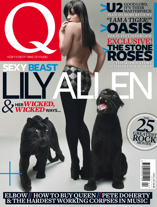
Q is the UK's biggest selling monthly music magazine, Q is the peacemaker of quality music. The magazine sits at the heart of a brand that discovers great music for its consumers. The Q brand has developed a worldwide reputation as a trusted and premium quality voice of musical authority amongst fans, musicians and the music industry - one that is founded upon Q's peerless access, world-beating exclusives and outstanding production values. This reputation is extended not only through the magazine but also across online, radio, TV and on into Q's unique events, which involve intimate live shows with major stars and the world famous annual Q Awards.
Q has a wide range of ways to communicate with the public such as:
- Q Magazine
- Q Radio
- www.qthemusic.com
- Q TV - Sky 364 , Virgin Media 338
- Q Awards
- www.twitter.com/qmagazine
- Facebook http://www.facebook.com/QMagazine
Q's audience is made up of passionate, engaged and open minded music fans driven to discover new music and to use this lust for discovery to influence their friends. The audience is split 75% male to 25% female.
Hollie - i really like the full body shot on the front on this magazine because i think it captures a lot about her personality and her attitude by the way she is standing. i think i would like to work with a full body shot on the front of my magazine because it means i can get a whole outfit onto the front cover and base a lot of it on fashion so it attracts a female audience aswell as male.
Hollie - i really like the full body shot on the front on this magazine because i think it captures a lot about her personality and her attitude by the way she is standing. i think i would like to work with a full body shot on the front of my magazine because it means i can get a whole outfit onto the front cover and base a lot of it on fashion so it attracts a female audience aswell as male.
Thursday, 13 October 2011
Mixmag Analysis - Hollie

- Still photo (Not live)
- Colours fit with house style
- Celebrity as main picture
- Contents split into different sections
- Organised down the side
- Not all over the place
- Aggressive image
- Picture of the front cover on the contents page
Preliminary task contents page - Matthew Music Mag
Colour – I used bright colours to make the cover look appealing to the reader and attract
attention.
attention.
Font – I used a simple font for the text so it looks professional and easy to read.

Image – I think this image is suitable for the magazine because it portrays the college well.
I also tried to place the image off-center, use the rule of thirds and get the lighting correct.
Model – The model in the image gives off the message that is intended. She looks to be working
hard with her work.
Preliminary task contents page - Hollie Music Mag
- List of contents
- Page numbers
- Images relating to stories
- Contents title
- The date
- Web address
 - Larger image of main story
- Page numbers
- Images relating to stories
- Contents title
- The date
- Web address

Thursday, 6 October 2011
Magazine Ideas - Hollie Music Mag
Magazine Ideas
Target audience: 14-19 year olds. Male and female
House style: Orange, blue and silver
Type: Indie music
Name: Outcast/ Record/ Junk
Contents:
- Updates on new releases
- Tour dates
- Interviews
- Up and coming bands
- Clothing lines
- Advertisements
- Free posters
Photo shoot:
- Indie style models – Alex, Jordan, Matthew, Hollie and Lucy
- Instruments – Drums, guitar
- Background – Brick wall, orange spray-paint
- Clothing – Indie, accessories
- Props – Instruments, drum-sticks, car
- Theme – Stripes, black and white
Thursday, 29 September 2011
Preliminary task front cover analysis - Hollie Fudge.

I think the picture works with this magazine because it is bold and colourful and makes the school clear to see. I have placed the model to the far right side so she is not the main focus.
The font colours are black and white because them colours stand out against there backgrounds. The title is blue for the colour of Brigg Sixth Form and is bold italic to stand out from the rest of the magazine cover.
The model relates to one of the cover stories because she is the girl that gives the advice to people, so I have made her look friendly and approachable so people get the right impression of her straight away.
I named the magazine brogue because it is a play on words with 'Brigg' and the well known magazine 'Vogue'.
I have made the price label blue as well, like the title, so that there are links created on the front cover. I have also put it the number of the issue and the date so people know more about the magazine from there first glance.
Thursday, 22 September 2011
NME Magazine Analysis - Hollie - Music Mag

- Not too much white space
- Young audience
- Punk rock theme
- Contrasting colours
- Bold, clear masthead
- Bold colours
- Youthful tone
- Informal
- Webpage
- Puffs
- Image matches magazine colours
- Banner across top and bottom
Evaluation of what i have learnt so far - Hollie - Music Mag
So far in the course, Hollie and myself have learnt how to use a Mac correctly. We have learnt how to save, upload and work on a Mac, as it is different to a normal desktop computers.
As well as using the mac in general, we have learnt how to use Adobe PhotoShop, to edit pictures and fonts with good effect.
We have learnt how to add things to the blog correctly, to upload images and text, and to edit the blogs' appearance.
As well as the computer skills, we have also learnt how to use a camera to good effect. We have been taught rules of photographs such as the rule of thirds and horizon. Lighting is also key to a photo, and we have been taught tricks to get lighting on a photo just how we want it. E.g. using a reflector (white card).
Also, we now know that we have to control the photo to how we want; to tell the model how we want them to look and to act, and to create the scene that we want to portray the right message.
Before we started the course, we didn't know how much went into a magazine. We have learnt all of the things that have to be thought about, all of the small details, from the colours, fonts and how the page is laid out.
Together we have learnt that it is not just our opinion on the magazine that matters, but it is our target audience's opinion that really counts. If we take into account their thoughts and point of view, we can give the target audience what they want, leading to a more successful product.
Subscribe to:
Posts (Atom)