
- Main photo to show main feature
- Page numbers to navigate magazine
- Long list of bands featured in the magazine
- Advert to subscribe to magazine
- Features catagory
- Black sans on white
- Large title including logo at top
- Subtitled categories
- Date in top right corner
- Large title (black on white)
- Black sans on white text
- Image, description and page number of main article in center of page
- Main feature surrounded by other features, including description, image and page number
- Not too neatly laid out, relaxed style
- Subscription advert bottom left corner
- Date above main image
- Other (maybe less significant) features listed with page number
- Picture lead page
- Text laid out neatly
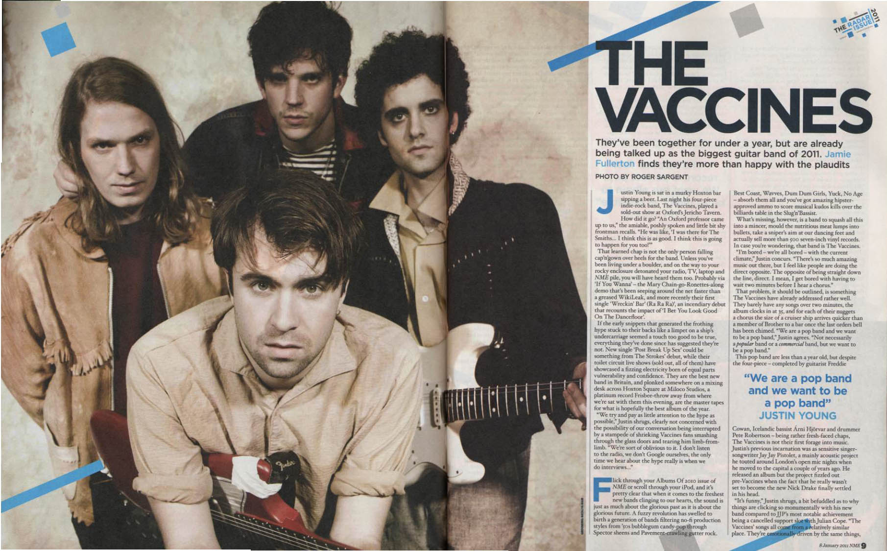
- Picture matches band's and magazine's style
- Same colour scheme on page
- Big title in bold writing, simply stating the name of the band
- Some colour is added to the page in text and image, so that it is not just brown/cream/black
- Pull quote is used between two sections of the article
- Rather than just one stand-first, two are used, both in blue to stand out
- Well written article, with some relaxed vocabulary to suit target audience

- Image dominant
- Very large pull quote taking up 1/3 of the page
- Neatly laid out article, although fairly small
- Banner in bottom left of first page describing the article
- Pull quote used as a title
- Picture of full band, similar coloured clothing
- Background goes with colour scheme


